|
Spotting the Bottom in the Stock Market
What a past few days, huh? We all pretty much knew we were due for a correction. But, who would've imagined it would take one of the worst days in years to remind us to never get too complacent?
One of the toughest parts about sifting through the aftermath is simply how so many - possibly all - of the tools we normally look at are skewed well beyond their normal ranges. Nevertheless, we still have to do our best to interpret all of them for what they say -- not for what we want them to say. We'll get through a handful of the market dynamic indicators we look at on a regular basis. However, we won't necessarily come to any absolute conclusion. Rather, we'll do our best to make as much sense of them as we can right now so we're fully able to make a call in the coming days -- once these charts start to offer a little more clarity.
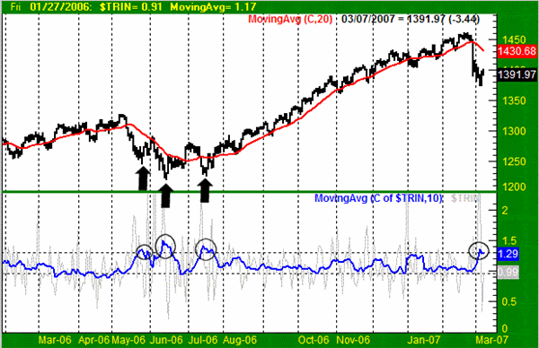
The TRIN indicator compares volume against the number of advancing and declining stocks. When there's a serious imbalance between volume and breadth, odds are that we're very near some sort of market reversal. Well, we've got a chart today to really illustrate that point, and a possible shortcoming.
To make sense of the TRIN indicator, a 10-day moving average line is typically used rather than the raw daily data itself (which is too erratic to effectively interpret). On our chart of the S&P 500, we included the Arms Index at the bottom, and overlaid a 10-day moving average line in blue. Clearly last Tuesday's extreme sell-off caused such a radical imbalance in breadth and depth (bearishly) that it seemed very unlikely things could get any worse. As such, it set up the strong possibility of a bounce.
In fact, you don't have to look too far back on our chart to see how this tool can be very effective. Just go back to July of last year, for instance. The 10-day moving average of the TRIN index reached up to 1.30 then, and it was indeed the bottom.
However, you only have to look back the two months before that to spot an obvious flaw in the idea. On two separate occasions in May and Hune of 2006 -- the TRIN index popped above the 1.2 level. In both instances, we did indeed see a short-term bottom from which stocks moved higher. Yet, it was clearly not the end of the selling.
S&P 500 with TRIN (& 10-day average of TRIN) - Daily

So while we still think last week's spike in the Arms Index has bullish implications, we don't necessarily think it has to be the ultimate bottom.
The point is, we can't just start and stop with this tool in our search for a true bottom. It generally works in the short run, but it doesn't carry as much weight when you're talking about an intermediate-term trend, which we may well be.
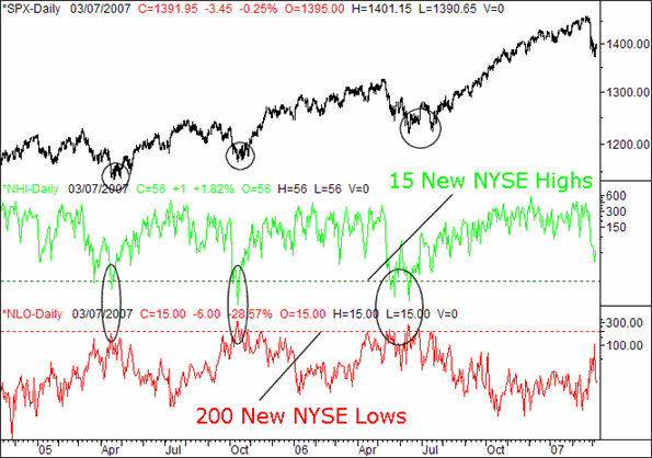
One of the other market dynamic tools we've examined on occasion is a comparison of the number of new highs and new lows -- specifically those of the New York Stock Exchange. Historically speaking we've found most short-term bottoms to occur when the number of new highs is less than 15, and where the number of new lows is greater than 200. Yes, there are some exceptions, but by and large we've found this is a good rule of thumb.
Well, guess what? We're not quite there yet. Take a look at the chart below. We're close, and getting closer, though we're not quite yet to that absolute extreme that truly can't get any worse. The closest we got to what is probably a true bottom was Monday, when the new highs totaled only 33, and we saw only 106 new lows.
S&P 500 with New High and New Low (NYSE) Readings - Daily

Granted, we've seen bottoms put in place without hitting those levels, but not very often.
So our bottom line conclusion here is still (no joke intended) inconclusiveness. We'll need to keep looking at other tools and use them in conjunction with this one - we still don't have a clear picture.
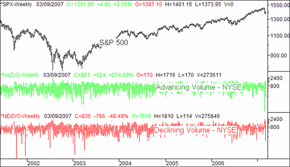
Lastly, the shakeout from last week prompted us to start looking at new ways of spotting potential tops or bottoms. We thought we might find a potential clue in the advancing volume or declining volume data for the New York Stock Exchange. After all, when the indices start to change direction, the volume data can really get wild during the transition.
The idea became particularly interesting last Tuesday when the declining volume was at multiyear lows. The scenario became even more curious this Tuesday when the declining volume was at multi-month lows.
We would have thought those kinds of spikes would have been associated with either a top or a bottom. But, we went back several years (back to the '80s) and found absolutely no consistent correlation between reversals and extreme readings of up or down volume.
S&P 500 with Up and Down Volume - Weekly

We know this flies right in the face of a lot of professional analysis. But, the data is the data. While we'd love to be able to find some sort of meaning - or a trading system - using the information, the fact is there's no consistent outcome from those wild volume swings. To try and make something out of nothing is not only undisciplined, but also poor science. We know there may be a little fallout by saying so, as a lot of people consider those volume spikes to also be pivot points.
That being said, if there is a consistent way you know of to use advancing or declining volume spikes, please feel free to let us know. In the meantime, we just didn't want anyone to assume something just because it seems like it could make sense. It seems rational on the surface, but that doesn't mean it actually gets results.
On a side note, while we can't quite use the daily volume data, we have successfully applied moving averages of the up and down volume data in building successful trading systems. So, there is still plenty of value in this information, if you know how to use it.
So, there's just a small portion of what we're looking at right now, and what we're not looking at. Nothing decisive yet, but we'll keep watching these charts for more.
Price Headley is the founder and chief analyst of BigTrends.com.
|