| Sector Strength at a Glance |
| By Price Headley |
Published
03/26/2007
|
Stocks
|
Unrated
|
|
|
|
Sector Strength at a Glance
After the shake-up from a few weeks ago, and the recent dead-cat bounce last week, a true sector trend has been difficult to spot. Rather than try and fit a square peg into a round hole and say we see a trend when there isn't one, we'd rather do something else that may actually be helpful.
Today's Sector Spotlight is a visual comparison of the percentage returns for each sector over a certain period of time. Though it doesn't show absolute progress for a certain sector, sometimes it's just as fruitful knowing how your preferred sectors are stacking against the others. After all, being in the right sector is said to be 30% to 50% of the battle, particularly if you're a longer-term investor.
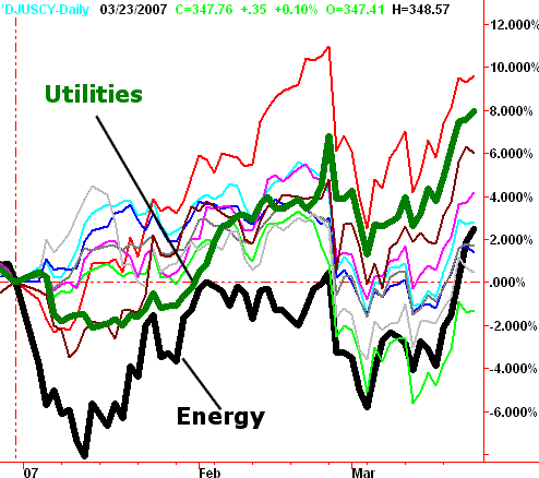
On the chart below, we've plotted the percentage changes of each major sector since the beginning of the year. Take a look, and then keep reading below for our initial thoughts.
Sector Percentage Changes Since 12/31/06

The two boldest lines are the ones we thought most noteworthy - utilities (green), and energy (black). The top-performing sector was basic materials (red), while the weakest results came from financials (bright green). Our apologies to anyone who's color blind, or printing on a black-and-white printer.
The utility stocks' strong performance surprised a lot of investors. More importantly though, the current trend suggests more of the same could be on the way. Perhaps even more interesting is the reversal of fortune we saw in the energy sector. It actually trailed for most of the year, but a big rebound over the last three weeks has pushed these stocks back to the middle of the pack, and they're still working their way higher.
Everyone, whether you're an investor or a trader, can benefit from knowing where the hot and cold spots are, though investors may get a little more functionality out of such an analysis.
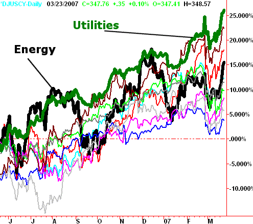
In fact, that functionality is greatly enhanced by a similar long-term, percentage-change chart. We've ranked the same major sectors again (same colors), only this time we went back one full year.
Sector Percentage Changes Since 03/22/06

See anything familiar? Utilities are on top - the picture of consistency. Energy is in the middle again - the picture of inconsistency, even if bullish. The second-best performer has been telecom (the red/brown color), while healthcare (royal blue) has been on the bottom since late last year.
The advantage to these charts quickly becomes clear to sector rotational theorists - the people who believe (like us) that there are always sectors falling in and out of favor. While utilities are hot right now, they're also ripe for the biggest of any potential pullback. In the same sense, though healthcare is ice cold, they may also be viewed as very undervalued under the right circumstances - and benefit from a sudden buying interest. Both are only possible swings for the time being, but represent the highest-potential swings we see.
Price Headley is the founder and chief analyst of BigTrends.com.
|