| Pick and Choose Your Battles in Trading |
| By Price Headley |
Published
04/4/2007
|
Currency , Futures , Options , Stocks
|
Unrated
|
|
|
|
Pick and Choose Your Battles in Trading
Well, April is officially here, and none too soon. Over the last few months, stocks have really gone nowhere, so I'm hopeful that the new calendar month will also bring some renewed interest in trading, though it's not historically supposed to. We don't even really care if it's a bullish or bearish environment, since both environments can be profitable. We just want to start seeing some movement -- any movement.
Just for some perspective.
-- The Dow Jones Industrials are down 0.6% for the year
-- The NASDAQ is up 0.3% for the year
-- The S&P 500 is up 0.4% for the year
That's just plain uninspiring - the market just can't get anything going. Are we complaining? Nah. That's just the nature of the market. Periods of high volatility are followed by periods of low volatility. That's the way it's always been, and always will be. It's just up to the trader to make the best of both scenarios, and maximize profits when the big opportunities arise.
So how do you know when the market is really moving versus just treading water? There are plenty of ways to get an idea of that. We use the CBOE Volatility Index (VIX) primarily as a fear and sentiment gauge, but it also does its job of forecasting volatility. Or you could use breadth and depth data to really test the undercurrent of the market. But one of the easiest methods that anybody can utilize is a very simple tool called the Average Directional Index (or ADX) line, which is just part of a two-pronged Directional Movement Index (or DMI) analysis.
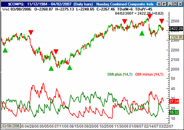
If you're familiar with DMI or ADX, then great. If you're not familiar with it, don't worry - it's a pretty easy concept. A Directional Movement Index (let's just call it DMI for short) analysis is just a set of two lines plotted on the same chart. One of the lines plots the day to day changes in the highs (not the closing price) for any given stock or index. That line is usually just called DMI+. The second line simply plots the day-to-day change in the lows for an index or individual equity. Most traders refer to this line as DMI-. The idea is that bullish pressure will be marked by a rising DMI+ line, since each day we see slightly higher highs. Conversely, if the DMI- line is rising, it means we're seeing lower lows, which is obviously a sign of bearish pressure. [That's a critical point. The DMI- line does not move lower when things turn bearish; it rises as the underlying stock chart weakens, which may take some getting used to.] If you're confused, don't be. A quick look at the chart below will clarify everything.
On our chart, the DMI+ line is the green one, and the DMI- line is red. The arrows marked on the NASDAQ Composite chart (top) indicate the points when we saw a major cross of the two DMI lines. Sure there were a couple of fakeouts, but by and large, this is a pretty good tool to spot new trends, whether bullish or bearish.
NASDAQ Composite, with DMI lines

But wouldn't it have been nice to not get faked out?
Well, there's a way. The Average Directional Index (or ADX) line can help you determine the spots where the DMI tool is meaningful, and where it's not.
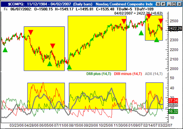
The chart below is the same as the one above, except this time we've added the ADX line to the DMI analysis. But first, the ADX line is simply the average of the difference between the two DMI lines. Think of it as an indication of the strength of the trend. In fact, the ADX line isn't even able to be bearish or bullish by itself, so don't even think of 'up' or 'down' as good or bad for stocks. It can only indicate the degree of difference between the DMI+ and DMI-lines. If the two DMI lines are widely diverged (or at least diverging), then it can only be because the stock or index is really moving, which is the environment trader's want. During this time, the DMI line will be rising. If instead, the two DMI lines are basically occupying the same space, it can only be because there really aren't any significant changes in the highs are lows. That, of course, is a neutral market scenario, and tough for traders to tolerate.
In any case, take a look at the chart below, and see if you spot the major difference with the ADX line when the market choppy, and not trending in any direction. The highlighted areas are when the ADX line was above 20, while anything not highlighted is when the ADX line was under 20.
NASDAQ Composite, with DMI and ADX lines

See the difference?
When the ADX line was high, or rising, the DMI crossover signals worked very well, whether it was a bullish or bearish signal. By only taking the trades where the trend was strong - as signaled by a high and/or rising ADX line - you would have been far better off.
The point is, there are only a few real opportunities in any given trading year. By focusing in on the best ones and not trying to squeeze blood out of a turnip, you'll find that your bottom line will greatly improve. This is particularly important right now, with the ADX about as low as we've ever seen it. The recent environment has been sideways, and therefore tough to trade. We foresee that changing in the near future, but you can bet we'll be keeping an eye on the ADX line to determine whether or not any new trend has enough strength to follow-through.
Now, the reason we said all of that, is so we could make a comment about today's DMI chart.
A lot of people don't want to believe it, but it's actually been a pretty good 'trading' market this year. But weren't we just complaining about being right where we started for the year? Well, sort of. If you look closely at the NASDAQ' chart, you'll actually see a couple of pretty nice swings....both of which were very trade-worthy of you caught them.
The implication? Believe it or not, it's actually decent environment for short-term trading -- provided you're right about your directional calls. The flipside is that you absolutely can't afford to think long-term here; something the ADX line doesn't exactly say.
In any case, that's the current deal. Don't mistake poor net progress for a tough environment - it's only been tough on longer-term traders. And, until we see the ADX line fall back under 20, we have no reason to think things will be different. We'll let you know when and if the ADX lines slips below the 20 level, as the strategies may need to change then.
Price Headley is the founder and chief analyst of BigTrends.com.
|
|