| Weekly Outlook in the Stock Market |
| By Price Headley |
Published
04/9/2007
|
Stocks
|
Unrated
|
|
|
|
Weekly Outlook in the Stock Market
NASDAQ Commentary
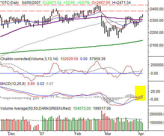
On Thursday, the NASDAQ Composite closed 12.65 points higher (+0.51%) to end the shortened week at 2471.34. That was 49.70 points higher than the prior week's close (+2.05%), which goes long way in getting the charts back to bullish again. Could it be simply the February 28th bearish gap acting as a vacuum? Or, is this upside effort a real indication that the market is already thinking optimistically again?
At the risk of oversimplifying things (including our forecast), look at the moving average lines -- at least all of them except the 200-day line (green). The 10- and 20-day lines (red and blue) are on the verge of crossing above the 50-day (purple) and 100-day (grey) lines. Painfully simple, yes, but also a frequent indication of a new uptrend. And, strict technicians will see that we have a new bullish MACD divergence (highlighted). The one thing we haven't seen yet - that we'd like to see to really get into the bullish camp - is volume. Though volume has been positive, it's also been noticeably less than even average.
Like we said above, perhaps this effort is just going to be enough to close that February 27th gap at 2492.54. From here (only about 20 points away), we're willing to wait and see if we can actually stay above that level. If so, then it would be easier to justify any optimism. To get fully bullish, we need to see smooth sailing past the recent multi-year peak at 2531.42. Both of those levels are marked with red dashed lines.
NASDAQ Chart

S&P 500 Commentary
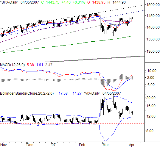
The S&P 500 ended the week at 1443.75. That was 4.40 points above (+0.31%) Wednesday's close, and 22.90 points (+1.61%) higher than the previous Friday's closing level. Though we still see a lot of vulnerability as we head into the 'soft' period of the year, the technical bullishness is starting to rematerialize on this chart.
Nearly everything we said about the NASDAQ Composite can also be said for the S&P 500, so we're not going to dwell on it here. Just recognize that all the short-term average lines are crossing above the longer-term lines, if they haven't already. Our view of the breakdown a little more than a month ago, and the subsequent recovery, is that the market took a breather. Now that it's 'reloaded', the steam can build again.
Yes, it wasn't an ideal correction, in the sense that it really wasn't as big as the 'normal' correction. That's likely to mean any subsequent rally won't be as big or prolonged as most. But, it is what it is.
As always, we're watching the VIX as much as the SPX's chart, though it basically says the same thing right now. After five straight lower closes, the VIX trend is to the downside - bullish as well. Moreover, Thursday's low of 12.69 is still more than 1.4 points higher than the already-falling lower Bollinger band line -- the most likely place where the VIX would finally find a floor and reverse. The irony is, the more rapidly the VIX falls, the more rapidly that lower band drops, stretching out the likely pullback, and by extension stretching out the market's potential rally. We still think the long-term support line right at 10.0 could be a factor though.
We still have resistance pegged at the recent peak of 1461.55. However, if we extend out the long-term bullish zone (dashed) that guided the mild rally in the last quarter of last year, there's also a resistance line at 14989 - and it's rising. At its current rate of climb, it could be at 1495 before it's challenged.
S&P 500 Chart

Dow Jones Industrial Average Commentary
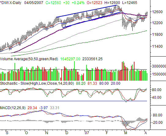
The Dow Jones Industrial Average had four straight days of gains, and it was actually six in a row if you go back to the previous week. Thursday's gain was good for 30 points, or +0.24%. On a weekly basis, we saw a rise of 206 points, or +1.67%. We also saw a quite-impressive recovery effort, putting the Dow back within striking distance of where it was before the late-February catastrophe.
It should come as no sunrise the same thoughts we had on the previous two charts also apply to the Dow's chart -- short-term averages over longer-term averages.
The concern we see here though is evident in the stochastic lines - we're now back into overbought status. True, being overbought hasn't always been problem the last several months, though it was a horrifying problem in late February. With both of those possibilities in view, we're not going to be overly-committed to either side of the market. However, it doesn't change the fact that the momentum is currently with the bulls.
Let's use the recent peak at 12,846 as the ceiling/resistance, for now.
Dow Jones Industrial Average Chart

Bottom Line
Take it all with a grain of salt. The buying spirit seems to have been rekindled, but we're also entering the most lethargic period of the year. Remember the phrase 'Sell in May and go away.'? It's a cliche for a reason. If the saying is made valid again this year - as we think it will be - then this recent bout of bullishness may just be one last hurrah. It would take some serious and obvious defiance of that sage advice to really make us think this summer was going to be unusually strong.
Price Headley is the founder and chief analyst of BigTrends.com.
|