|
What Does $1 of Debt Buy in Terms of GDP?
How much debt does it take to grow GDP? You probably missed it, but the Bureau of Labor Statistics gives us data that contradicts the recent labor numbers. Why is consumer sentiment so moribund? And that recession I predicted for 2007? I have a few thoughts on that as well. It should make for an interesting letter with a lot of great charts and graphs.
What Does $1 of Debt Buy in Terms of GDP?
This week one on my favorite money managers (Rich Lashley of PL Capital) sent me some very interesting research by Dick Bove of Punk, Ziegel and Company. The topic was about the marginal utility of debt. What is the ratio of the growth of debt to the growth of the economy? He has a number of great charts. Sentences in quotes are Dick's and my comments are interspersed.
First, let's look at the growth of total credit market debt to GDP and interest rates. Note that there was an explosion of debt as rates came down during the 80's and 90's, along with an increased supply of capital looking for a home.
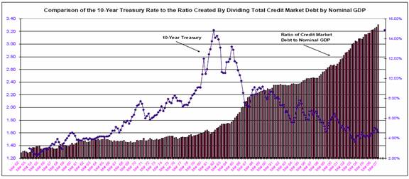
If one converts total outstanding debt into a real number using the GDP deflator, the marginal utility of debt is even worse. In the 1960s, real total debt outstanding in the U.S. "bought" $0.64 in additional real GDP. In the current decade, a dollar of real additional debt now "buys" $0.15 in additional real GDP.

Why the difference? Why does debt seem so less productive today? Dick writes: "An intriguing question raised by the comparison in the chart above is why did marginal debt in the 1960s and 1990s buy more real GDP while in the other decades it purchased less GDP? Better minds than mine are needed to answer this question. However one simplistic reason may be that in the 1960s and mid to late 1990s corporate debt rose faster than total debt - i.e., debt may have been used to increase productivity to add GDP."
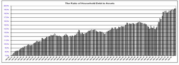
I think that is a lot of the explanation. We have all seen the charts like the one below which show the rise in household debt in the United States. Less than 30 years ago total debt of US households was less than $1 trillion. Today it is over $13 trillion. Americans have done their part in keeping the world economy going by assuming an ever increasing amount of debt.

But an increase in debt for consumer purchases does not add to the productive capacity of the country. Buying a machine to make auto parts or (pick a product) potentially increases the productivity of the total economy for many years in the future. Buying a TV does not. A computer that helps increase work flow and business transactions is an investment in productivity and business. A computer that copies music at your home does not.
In 1972 the ratio of business debt to total debt was about 34%. Today it is 20%. The absolute level of business debt is rising over time, but the level of growth in consumer debt is dwarfing it, thus pulling the ratio down. Much of the growth in debt in recent years has been for either homes or consumer purchases, neither of which increases the productive power of the economy, and thus have no ongoing affect on GDP growth. I suspect, although I know of no way to verify, that a dollar invested in capital goods today is probably more productive, at least to the company, than it was 30 years ago.
And it is not as if US businesses do not have the capital to invest. Indeed, the balance sheets are stronger than ever and debt costs less than it has for 50 years. US businesses are not investing in capital goods. The growth in capital spending by business has been anemic for the past year or so. Clearly they are not seeing a lot of opportunity, except to buy other companies, as the merger and acquisition market is boomimg.
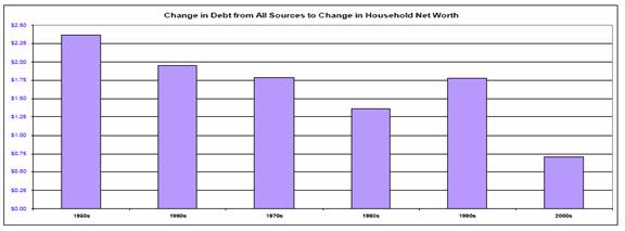
Properly used, debt is a good thing for a business, and can help grow the business over time, and thus the wealth of the shareholders and the economy at large. But if debt is a good thing for business, has it helped the consumer increase his wealth? And the answer is that the ratio of change in debt to net worth for households is dropping.
"However, when all the data are in, it is apparent that increases in debt are simply not working as hard to build household wealth (the stock market bubble in the 1990s diverted but did not change the trend)."
A few thoughts in the growth of debt. Clearly debt cannot grow faster than GDP forever. At some point the service of that debt overwhelms the ability to grow debt. But as (if?) rates stay low, the ability of the ratio of debt to assets to rise is still in the cards.
But consumers don't always increase that ratio. Look at the next chart and note that there are times when consumers pull back. During recessions or times of asset drops, or both, households tend to pull back. No great insight there. What if asset prices in the form of home prices actually falls? Might consumers look to decrease their debt burden? This is what research suggests should happen.
Interestingly, the ratio was falling during the late 90s as the stock market rose, allowing people to feel free to borrow more as their assets were rising. And the rise in home prices allowed them to feel wealthy again and borrow more until the ratio is now at an all time high, catapulting almost 5% in the last 5 years.
Reality Versus Polls
The Bureau of Labor Statistics does a monthly survey of employment, calling roughly 50,000 businesses to get an estimate of the number of jobs created or lost over the preceding month. It is an estimate. They have a statistic to account for jobs they miss in the survey called the birth/death rate, based upon past trends. If you are going to have to make an estimate of employment, it is as good a method as any.
The BLS survey shows payroll growth at 1.8% and had wages growing at 4.3% last September. But then they come back and produce another report from hard data that comes out a few quarters later, which covers 98% of US jobs. They also go to state unemployment insurance programs which have reasonably accurate figures at to wages and taxes.
They just released the data for the third quarter of 2006. It looks like actual job growth was 1.5%, somewhat lower than the estimates. But the real eye opener was that wages grew an anemic 0.9% on a year over year basis. Given that inflation was in the 2.5% range, this means household income did not keep up with inflation.
Combine that with today's release of the Producer Price Index which showed prices rising by 1% following February's rise of 1.3%, which suggests that there is still some inflation in the pipeline, and an increase in the number of continuing jobless claims and it is no wonder that consumer sentiment is dropping. Sentiment hit a cycle high in January and has deteriorated rapidly since then.
BLS monthly numbers are based on a methodology that is backward looking. I believe that April has the highest number of estimated jobs created annually in the birth model, thus perhaps overstating the actual numbers of jobs created. This birth/death model is based on past historical trends. Thus there is no way that the BLS data will catch the real drop in employment from a recession until they go back and look at the data a few quarters later. About the most you can expect is that they will get the direction right, so take the numbers coming out in the next few months with a few grains of salt.
(This is not meant to criticize or suggest some conspiracy. The BLS staff is charged with making estimates way before they get enough data and they do as reasonable a job as one can expect. I am glad it is not my job, however.)
It's the Economy, Stupid!
A lot of (mostly liberal) pundits want to blame the lousy sentiment numbers on Bush and the war in Iraq. I seriously doubt it. It's the Economy, Stupid. The University of Michigan Consumer Sentiment Survey polls sentiment about both present conditions and future expectations. The number indicates that consumers are far more pessimistic about the future than they are the present, although as noted both are trending down. Let's look at a few snapshots to get a sense as to why people are getting nervous.
The Liscio Report, among other things, tracks sales tax receipts from the various states. They report a serious deterioration in sales tax receipts in March. "In March only 18% of the states in our survey hit or exceeded their estimated sales tax collections, and levels in just over 30% of the states were lower than they were in March 2006, some quite steeply so." (www.theliscioreport.com)
Again, if inflation is 2.5%, you would expect sales tax receipts to grow year over year, not drop as they did in 30% of the states. Part of the reasons suggested were lower spending on home materials, as well as increased unemployment in some of the states, especially the Mid-west.
"In the states with the hottest housing markets, where one-third of sales tax growth was estimated to be directly related to the housing market, the housing market is the obvious culprit. Our contacts report building materials in double-digit decline, and not one felt comfortable suggesting when this might turn around. These states are now missing recently lowered collections, and many are negative year over year."
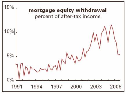
Some of this softness is certainly due to a decrease in mortgage equity withdrawals. Look at the following chart to get sense of the drop.
Can Housing Prices Fall as much as 20%?
My guess is that chart is going to drop some more over the next year, although MEWs are not going to disappear. There is still a lot of equity in many homes that can be tapped. Why a continued drop? Because home values in many places are going to drop, creating less equity to tap. This week Kenneth Heebner, manager of the top-performing real-estate fund over the past decade (and the top-performing diversified US fund this year), said U.S. home prices may plunge as much as 20% because of rising defaults on riskier mortgages. Heebner runs some $6 billion in various funds through Capital Growth Management.
Subprime loans, made to borrowers with a history of missed payments or untested credit, and "Alt-A" loans, which require little or no documentation, account for about $2.5 trillion of the $10 trillion in outstanding mortgages, according to Moody's Economy.com. As much as 40% of these loans may default, flooding the real estate market, Heebner said.
"It will be the biggest housing-price decline since the Great Depression," Heebner, 66, said today in an interview in Boston. Prices may fall by a fifth in some markets, he said. (From Bloomberg.) Interestingly, has sold all his investments in apartment REITs, which he thinks will come under pressure due to competition from all the homes coming on the market.
He is not alone in expecting a serious drop in home values. Gary Shilling thinks it could be even worse, and a lot of analysts are thinking drops on the order of 10%. It will vary region by region, but those of us who lived through the disastrous crash in the housing market in Texas in the late 80's created by easy credit and a drop in oil prices know that a 20% drop is quite possible.
The always bullish National Association of Realtors says new homes sales will fall by 16%, and existing home sales by 2%, the first drop on record, as subprime mortgage delinquencies climbed to a record 13.3% in the fourth quarter. Anecdotal evidence suggests the rate of delinquencies is rising rapidly.
As I have written about in previous letters, there is a strong correlation between consumer sentiment and housing prices, much stronger than the correlation with stock prices. So it is not a surprise to see consumer sentiment dropping and future expectations so disappointing.
The mid-cycle slowdown or possible recession I see in the future is possibly going to be a lot slower in development than normal. Most bubbles correct fairly quickly in terms of time. It won't be this way with the housing bubble. People are going to be reluctant to sell at a lower price than they think their home is worth, so it typically takes many months for them to get used to the fact that home prices have dropped. Instead of a bubble bursting, the more correct analogy may be a slow tire leak.
This is looking to me like a classic "sell in May and go away" year. April is usually the strongest month of the year for stocks, and it appears that traders are playing it that way. That also means they will have their fingers on the sell button faster than usual. We could see some real volatility in the coming months.
The Dollar Is a Weak King
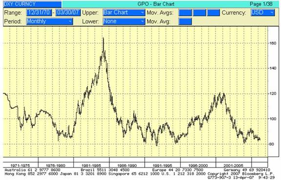
I can't close this letter without noting the material weakness in the dollar that has been developing over the past few weeks. The chart below shows the trade weighted dollar average is once again threatening all time lows. With the ECB poised to raise rates, the euro is likely to rise some more. It is 135.15 as I write, and the pound is almost $2, at $1.98. The Canadian dollar is back up $.88. I was predicting that the Canadian dollar would reach parity with the US dollar 3 years ago when it was at $0.70. I would get laughs when at speeches in Canada. Now I get nods and some worried looks.
(I also wrote four years ago that $1.50 euro was quite possible. That was when the euro was around $.90. I am now not sure it will get that high, but it is certainly going higher over time, I think. And for the record, I think it will go back down in the next decade as Europe confronts it demographic problems and drastically under-funded pension commitments.)
This recent round of weakness is disconcerting, as it is not putting a bid into bonds as it has done in the past. There is a somewhat different feel to this market.
John Mauldin is president of Millennium Wave Advisors, LLC, a registered investment advisor. Contact John at John@FrontlineThoughts.com.
Disclaimer
John Mauldin is president of Millennium Wave Advisors, LLC, a registered investment advisor. All material presented herein is believed to be reliable but we cannot attest to its accuracy. Investment recommendations may change and readers are urged to check with their investment counselors before making any investment decisions.
|