|
Weekly Outlook in the Stock Market
NASDAQ Commentary
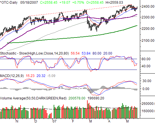
Though it was Friday's biggest winner with a 0.75% rally, the NASDAQ Composite was the only index to not hit new multi-year highs that day. The best the OTC could do was 2559.03 before ending the session at 2558.45 (+149.07 points). For the week, the NASDAQ still closed down by 3.77 points, or -0.15%, the only index to take a loss, which remains a bearish point of contention.
This is an interesting chart with plenty of mixed messages. Thanks to Friday we're actually looking at a lot of new bullish patterns. Namely, a cross back above the 10- and 20-day lines. The question is, is that really a big deal? Normally we'd say no, but in the current environment, it may well be enough to prod a few days worth of buying. That dip may have bled enough pressure to safely restart the buying effort again. After all, we've already defied the odds. Additionally, we have a renewed bullishness on our stochastic chart, by virtue of the %K line crossing back above the %D line.
Bearish clues? Yep. Check out the MACD lines. Heck, for that matter, check out the weekly results. The NASDAQ closed in the red. Given that the NASDAQ typically leads (both up and down), we can't ignore the fact that this chart is weaker than the other three. Why is that? No answer yet, but we worry about it.
Just for the record, the NASDAQ has yet to break past a long-term resistance line (red, dashed), keeping this whole rally in question.
NASDAQ Chart

S&P 500 Commentary
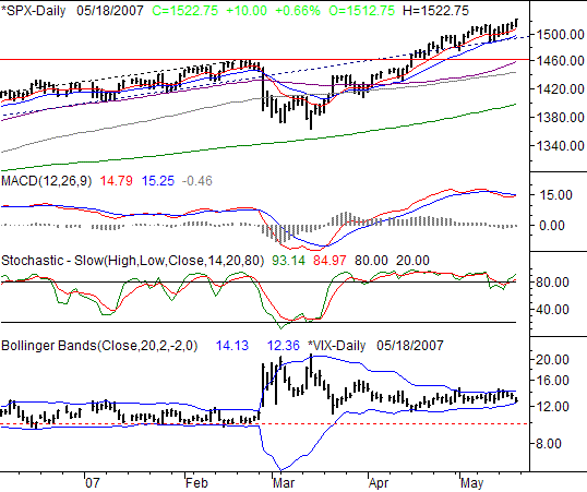
The S&P 500's 10.0 point gain on Friday (+0.66%) left it at 1522.75, also the high for the day (and a new multi-year high at that). That meant a gain of 1.12% for the week, or +16.90 points.
Above we made a few comments about the OTCs bearish signals. We can't really say the same for the SPX. It's bullish all the way around. Stochastics and MACD lines are both showing renewed buy patterns.
What we're blown away by, though, is the 10- and 20-day lines - they're ridiculously consistent support. From this point going forward, they're going to act as our key signal lines. The 10-day average (red) is currently at 1507.95, while the 20-day line (blue) is at 1497.48. You can see how retests of both have led to rebounds since April. Until that stops happening, we're not going to get in the way of the upside train.
Counter-argument? The VIX. On an absolute bases, Friday's dip from 13.51 to 12.76 may seem like a snoozer. As we've been documenting for weeks now, the VIX has been incredible well contained. That's fine, but it ain't permanent. The slow constriction is setting up an explosive break, to one side or the other. And, given that the VIX is on the lower part of its average (historical) trading range, we feel the path of least resistance may be to the upside, which is bearish for stocks.
In the meantime, look real closely where Friday's low was made at the lower Bollinger band. Now look back at recent encounters at the lower band. See any that followed through to the downside and continued to push the VIX lower? Not one. Rather, we saw support at each instance, and we saw stocks suffer because of it.
Granted, Friday was option expiration, which means there could have been unusual pressures pushing the VIX around. However, we go through an expiration every month, and none of them were an exception to the pattern. We shall see. In the meantime though, the bulls seem to still be in control.
S&P 500 Chart

Dow Jones Industrial Average Commentary
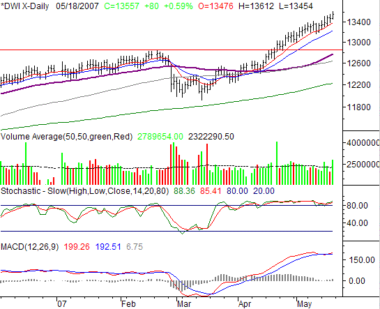
On Friday, the Dow's high of 13,612 was yet another new all-time high, while the close of 13,557 was 80 points higher than Thursday's close -- a 0.59% gain. On a weekly basis, that meant as gain of 231 points, or 1.73%.
Just incredible. New all-time highs, without even a second thought. Good volume behind the buying too. The momentum here is clear, and the bullish MACD and stochastic lines both prove it. The stochastic lines are bullish in the sense that they seem to have no problem staying in 'overbought' status.
The vulnerability remains the same. The Dow is now 10.8% above its 200-day moving average line (green). However, that vulnerability is only a possibility for the time being. The reality is, the bulls don't care.
The 10-day moving average line (red) seems to be the key signal line here, as the Dow has found precise support there for weeks. If it and the 20-day line (blue) start to crumble, that may be a big deal - it would be the first time in weeks they started to give way.
Dow Jones Industrial Average Chart

Price Headley is the founder and chief analyst of BigTrends.com.
|