| Is the Stock Market Hitting a Top? |
| By Price Headley |
Published
05/30/2007
|
Stocks
|
Unrated
|
|
|
|
Is the Stock Market Hitting a Top?
Several weeks ago we had a pretty in-depth discussion about spotting a real market top and bottom. The general theme was that tops and bottoms are typically signaled by a big bang of sorts. We just meant that bottoms were typically made when things looked the worst, and tops were made when things looked the best.
A couple of example dynamics we explored were breadth (the number if advancing stocks versus declining stocks) and depth (the volume of advancers verses decliners). When either of those continuums got way out of whack, odds were that the end of the trend was nigh.
However, we certainly didn't want to give you the impressions that all new trends had to begin and end that way. They frequently do, but not always. It's very possible they end on a quiet note -- inconspicuously. By their very nature, these kinds of reversal happen without much fanfare, if any at all.
So, we spent the next few weeks on a search for the point in time when the NYSE's new highs or new lows hit ‘bizarre' levels. Likewise, we spent the next several weeks looking for a NYSE TRIN reading (a measure of breadth versus depth) of the same bizarre ilk.
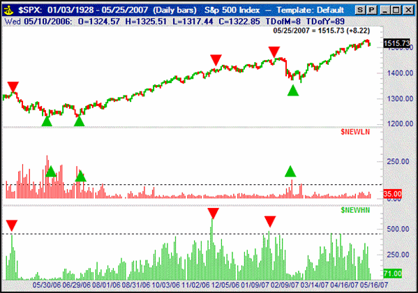
Why? Just take a look at the charts below. The first one is a comparison of the NYSE's new high and new lows. Clearly the market has made major reversals when either of those measures hot extreme levels.
S&P 500 with NYSE new highs/new lows – Daily

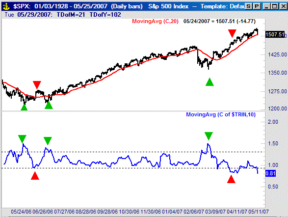
This one’s a chart of the short-term moving average of the TRIN reading. It too has a pretty good track record of pin-pointing when enough is enough.
S&P 500 with 10-day average of TRIN – Daily

So why the history lesson? A funny thing happened while we were searching for a bottom after the late-February disaster. We never got a good ‘breadth of depth blowout’...though stocks have clearly moved higher since then.
In the same vein, now that stocks have been a little less confident, we’re not necessarily seeing those same kinds of toppy signs; breadth and depth have been about average.
So what’s the solution? First and foremost, realize that this isn’t anything out of the ordinary. Sometimes we get certain kinds of readings. Other times we don’t get those kinds of extreme readings. However, we’ve almost always got something to fall back on.
Some of you may remember this chart; it’s the moving average of advancing and declining volume. If you’re not familiar with it, here’s the quick and dirty.
In a nutshell, we built this tool to spot underlying volume shifts in bullish and bearish equities. This isn't a plot of the number of advancers and decliners for any given day. Instead, we want to see the total volume for all the advancers and the total volume for all the decliners for a particular exchange.
Why? Watching the advance/decline data alone can be deceptive. Just because the majority of stock issues may gain on any given day (or week) doesn't mean they did so with any meaningful volume. On the flipside, even if only a handful of stocks decline, if the volume behind that selloff was huge it should be a major concern. In other words, given the choice between following the direction that stocks appear to be going versus following the majority of the volume, we'll pick volume. Again, why? Because the volume trend tends to shift slightly in advance of the price trend.
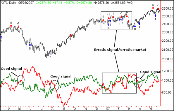
To put this 'up' volume and 'down' volume in a useful format, we've plotted moving averages of recent NASDAQ data on our chart (the daily data is way too erratic, so we had to smooth it). The green line is the 'up' volume moving average, while the 'down' volume moving average is represented by the red line. The buy or sell signal is a cross of one over the other, marked with an up or down arrow.
Sorry, the details are proprietary, but you can see from the chart alone the value of the idea. Though we saw a lot of fake-outs in January and February, this analysis has tagged some pretty good entry points as well -- both bullish and bearish.
NASDAQ Composite + moving averages of advancing volume/declining volume – Daily

Perhaps more importantly, we were able to make good use of important market dynamics, even though none of them really hot the extremes we typically look for.
Price Headley is the founder and chief analyst of BigTrends.com.
|