| International Relative Strength |
| By Price Headley |
Published
06/11/2007
|
Stocks
|
Unrated
|
|
|
|
International Relative Strength
We’ve looked at the idea of relative strength before. One thing we haven’t yet done, though, is take a look at international relative strength. What are the hot and cold spots on a global basis? Today, we’ll round out our study and answer that very question, using international ETFs as the root of the analysis. Specifically, we’ll be looking at the iShares collection of international ETFs. Why? They have the most robust list.
Just to get everyone up to speed on how this works, what we’re looking for is a relative performance of a particular international over a certain timeframe. To really compare apples to apples, we’ll be plotting the percentage returns of some of the more popular country/region ETFs. We're looking for
1) Leaders
2) Laggards
3) ETF’s that may be changing direction
We are NOT necessarily interested in buying the top performer, or shorting the weakest one. If anything, those best and worst ETFs tend to be reversal candidates more often than momentum candidates. On the other hand, those best and worst performers certainly are capable of maintaining their trends. There’s always more to the story, which means further study beyond relative strength is merited.
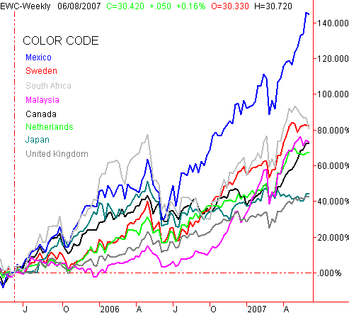
OK, here’s what the major international ETF’s have been doing compared to one another (on a percentage basis) over the last two years.
International ETF Performance Comparison (percentage) – Two Years

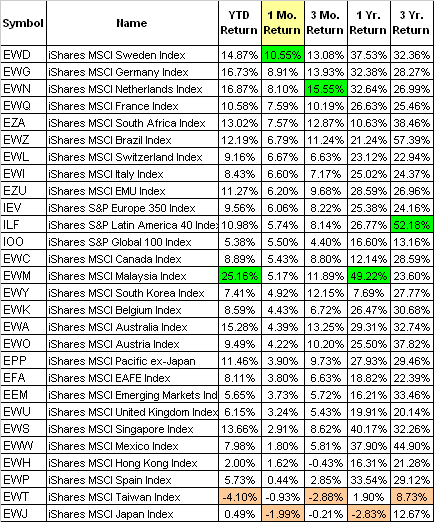
Here’s a complete list with some performance data in a table format, ranked by one-month returns. The top performer for each timeframe is marked in green, while the weakest performer is highlighted in orange. Those might be your prime reversal candidates, though we’d also encourage you to look for other performance measures that indicate something is different now than it was then. For instance, Latin America was red hot a couple of years ago, bet has cooled off quite a bit. Taiwan and Japan, on the other hand, seem content to stay at the bottom.
International ETF Performance Table

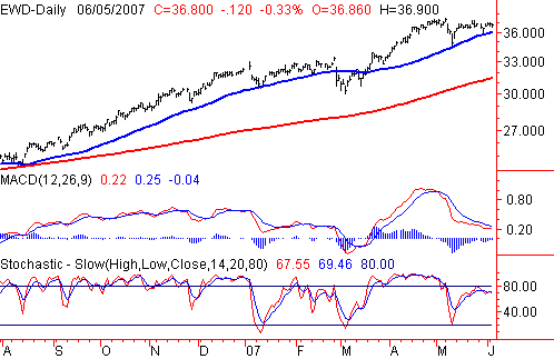
Just to get you started, here’s a chart of a surprising leader – the iShares Sweden ETF (EWD). The numbers look pretty good, but when you look at the chart, all of a sudden the picture isn’t quite as compelling, at least not right now. The moving averages are a 50- and 200-day line.
iShares Sweden ETF (EWD) – Daily

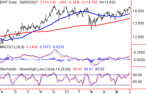
Here’s the iShares Taiwan ETF (EWT). Its performance numbers don’t look all that great, but when you look at the chart you have to wonder if it’s finally pulling out of its funk. The moving averages are again a 50- and 200-day line.
iShares Taiwan ETF (EWT) – Daily

So, the follow-the-leader premise doesn’t really look all that great right now, at least for the ETFs at the very top and very bottom of the list. The other ones in the middle that haven’t been so hot or cold may be able to better sustain a rally, as opposed to setting up a reversal.
In any case, you now have some data and a concept of how to use it. Now go out there and find those ETF trading ideas.
Price Headley is the founder and chief analyst of BigTrends.com.
|