| Best and Worst Stock Sectors |
| By Price Headley |
Published
06/26/2007
|
Stocks
|
Unrated
|
|
|
|
Best and Worst Stock Sectors
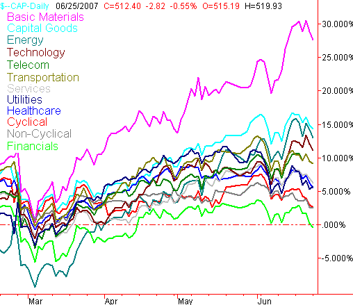
Today, we've printed out the percentage-change chart for the major sectors. The sectors have been rising and falling in unison, but we at least have some interesting differences that may also be highlighting some "best of" opportunities.
We're looking for a few things like new momentum, waning momentum, and shifts in leadership or laggardship (even if it's not really a word). Though nothing is blatant right now, we do have a handful of observations about the current sector picture.
Sector Percentage Performance - Year To Date

First and foremost, that pink line represents basic materials. They've been red hot lately, which is a two-edged sword. The momentum is with them, but so is the vulnerability. If they start to break down on their normal chart (not shown), then we suspect these names will be the first and farthest to fall.
There was also something else very subtle we saw yesterday. The utilities stocks actually gained a little ground. They're also one of today's leaders. However, one day does not make a trend. In fact, the utilities were a bit of a disappointment a few weeks ago. After staying in the top half of all sectors through May, they just stated to drift lower. They're an interesting recovery possibility, but as of right now, they still hold a little too much risk for us, compared to the potential reward.
The financials are the green line. They've been at the bottom for a while, and slipped back into negative territory as of yesterday. The idea of rotation carried weight with us, but we don't see it happening here just yet. Right now, all we see is a very troubled financial sector.
Other than that, the sectors still seem to be unusually tightly grouped. More often than not, we see a little more disparity than this. We do expect to see some differentiation soon, so we'll show you this chart again when it looks like we may have some.
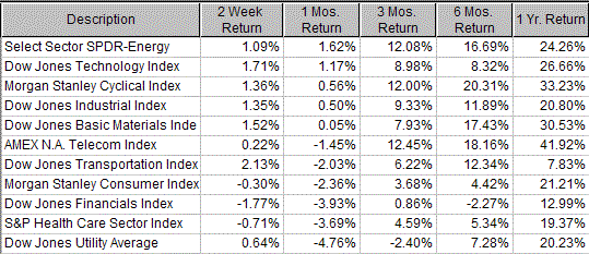
In the meantime, here's the numerical data on some of the major indices (minus a service index). This table below doesn't exactly match up with the chart above, as our graph above is based on SIC codes, where the index components are generally hand-picked. However, the same basic ups and downs still apply. One notable exception is the Morgan Stanly Cyclical Index. In the table, it's the 6-month leader; on the chart, cyclicals are near the bottom.
Major Sector Indices - Percentage Returns Over Various Timeframes, Ranked by One-Month Results

Price Headley is the founder and chief analyst of BigTrends.com.
|