| Weekly Outlook in the Stock Market |
| By Price Headley |
Published
07/2/2007
|
Stocks
|
Unrated
|
|
|
|
Weekly Outlook in the Stock Market
NASDAQ Composite Commentary
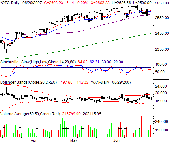
The NASDAQ Composite’s 0.2% loss on Friday (-5.14 points) left it at 2603.23. For the week though, that still left behind a 0.55% gain (+14.27 points) thanks to Wednesday’s big bounce. The NASDAQ’s relative strength continues to be an overall bullish argument.
Take a look at the 50-day moving average line (purple), the 10-day line (red), and the 20-day line (blue). All of them played a support role this past week, and the NASDAQ closed above all of them. It is what it is, which is still bullish.
On the other hand, take a look at the volume bars. The red bearish volume bars continue to be taller and more numerous than the green bullish volume bars. So far it hasn’t mattered, but volume is usually a pre-curser to trend shifts.
From this point, our bearish line in the sand is going to be the 50 day line at 2573. A close (or two) under it would be bearish. Anything else, and we have to assume the bulls will step up to the plate again. On the flipside, only a close above the recent ceiling of 2631 would inspire us to be any more bullish.
NASDAQ Composite Chart

S&P 500 Commentary
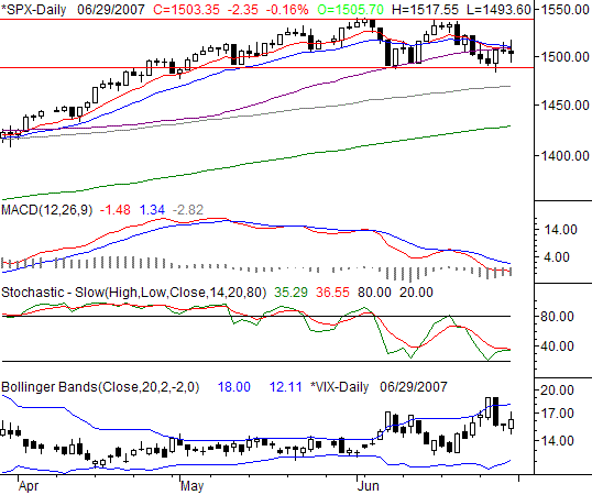
The S&P 500 closed at 1503.35 on Friday, after a 2.35 point (-0.16%) dip. That was just a fraction above a break-even for the week -- 0.8 points higher than the prior week’s close. Though still a positive move, the SPX is starting to find some substantial resistance.
You know the 10-, 20-, and 50-day lines we were looking at on the NASDAQ’s chart? They’re back in play again here, but on the other side of the chart. Rather than acting as support, here they’re acting as resistance. The S&P 500 attempted to cross and close back above all three of them on Thursday and Friday. It failed both times.
Also – and this is very subtle – for the first time in weeks, the SPX failed to make a higher high, and then turned around and made a lower low (though barely). The high watermark was about 1540, reached in early June and mid-June. The low bar was 1487, touched on June 8. Wednesday’s low of 1484.20 broke new ground, even if things turned around again immediately. To see it occur right before the index started to struggle with short-term moving averages does not exactly bode bullishly.
The MACD lines are also still pointed lower, as they have been for weeks. The VIX may be back on the rise as well, though that won’t become clear until Monday.
The next bearish step will be a close under 1487. The next bullish hurdle is obviously the three short-term moving averages, all right around 1509. If we can actually get above the recent peaks around 1540, that may really spark a bigger move higher.
S&P 500 Chart

Dow Jones Industrials Commentary
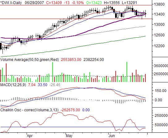
On Friday, the Dow Jones Industrial Average closed just 13 points lower (-0.1%). For the week, it closed 49 points (+0.37%) higher. Where the NASDAQ was slightly bullish and the S&P 500 was slightly bearish, the Dow appears to be caught between a bullish rock and a bearish hard place.
The potential double-top? Yep, the Dow made on of those, around 13,750. The lower low after that second top? We’d say no. It was more like a double-bottom. Wednesday’s low of 13,205 was basically even with early June’s low of 13,208. So at this point based solely on price the chart, we have to say the Dow is in a trading range.
And the moving averages? There’s support at the 50-day line (purple), and resistance at the 10- and 20-day lines (red and blue). The squeeze is on though the 10- and 20-day lines are falling, while the 50-day line is rising. They’ll intercept sometime this coming week, and by default the Dow will have to be on one side or the other of all three of them. We’ll follow that lead.
On that same note, when the 10- and 20-day lines fall under the 50-day moving average, it will be the first time it’s happened since February. It’s also a major intermediate-term sell signal, so again the market has a heavy burden it may not be able to bear. The MACD lines are already bearish, as if the 10/20 day line cross under the 50-day line wasn’t enough.
Volume? This is a bit tricky here. To look at it visibly, we’d have to say the tide was turning bearish – we’ve started seeing more red bars, and they’re plenty tall. The Chaikin line though (which is more objective), isn’t saying quite the same thing…at least not yet. We’ll continue to watch the volume trend here, but we expect to have some more meaningful ‘tells’ from the price action – and soon.
Dow Jones Industrials Chart

Price Headley is the founder and chief analyst of BigTrends.com.
|