|
A Mid-Week Look at the Market
NASDAQ Composite
On Wednesday, the NASDAQ Composite slid back by 40.3 points, or 1.61%, to close at 2458.8. That's 86.1 points under Friday's close.....down by 3.38% since then. Needless to say, right when the market needed to rebound, things got uglier. Now the NASDAQ is under its 200 day moving average for the first time in months. For that reason we're cautious, yet we still can't shake the feeling that a bounce is nigh.
On the chart below, the green line - the one the composite just fell under - is that 200 day average we're talking about. We don't take the crossunder lightly. We're not saying it's insurmountable...we're just saying this strikes a bigger blow than we first imagined we'd take.
NASDAQ Composite - Daily
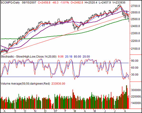
For a while, we've been comparing this dip to the one seen earlier this year. Now knowing what we know, perhaps we should actually be comparing it to the one from 2006. With that one, the 200 day line didn't act as support, and the NASDAQ tumbled a total of 15% from peak to trough. So far for this one, we've still only given up about 9.7% (from the high to low). That's certainly inline with the arbitrary 10% dip requirement to qualify as a full-blown correction, but it doesn't mean more's not on the way.
That said, nothing negates the capitulatory signs we've already seen (high TRIN levels, ridiculous news highs and new lows, VIX and VXN through the roof). That's the rub - two distinctly different arguments. Had all those breadth and depth skews happened two weeks and 5% lower from here, it would be easy to be bullish. Now though, it's not clear who's winning this war.
After colossal losses on Wednesday, we expect to see a dead-cat bounce. That won't mean anything...until the 10- and 20-day lines are approached (red and blue, respectively). Getting past those humps first will be a challenge, and the only way we can have any real certainty things are looking bullish again. Otherwise - and this very much on our minds - the overall scenario may be setting up some decent bearish trades. It all hinges on the 10- and 20-day line. If we cross back under the 200-day line after a retest, look out below.
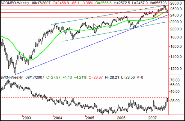
On the weekly chart of the NASDAQ (below), that possibility become very clear. The red lines are the Fibonacci lines we drew last time we looked, but when we zoom out, we can see a much different set of longer-term trend lines.
The blue support line that extends all the way back to the 2002 bottom is near, but we don't believe that one means much. The more meaningful channel - in green - is the one that seems most relevant. That lower edge is at 2195. Seems crazy, but we've made that trip before (in 2006, to be exact).
Don't start making bearish plans just yet though. On this weekly chart we've also added the VXN. As you can see, it's at ridiculously high levels on a relative basis, and at pretty high levels even on an absolute basis. Though we've mentioned our belief that the VXN (and VIX) are now starting to create a new 'normal' range as a new era of volatility is ushered in, we also think the VXN's (and the market's) limits may be close to be being met.
By the way, that thick, bright green line is the 200-day average. You can see it's not been the NASDAQ's best ally in recent years.
NASDAQ Composite - Weekly
S&P 500
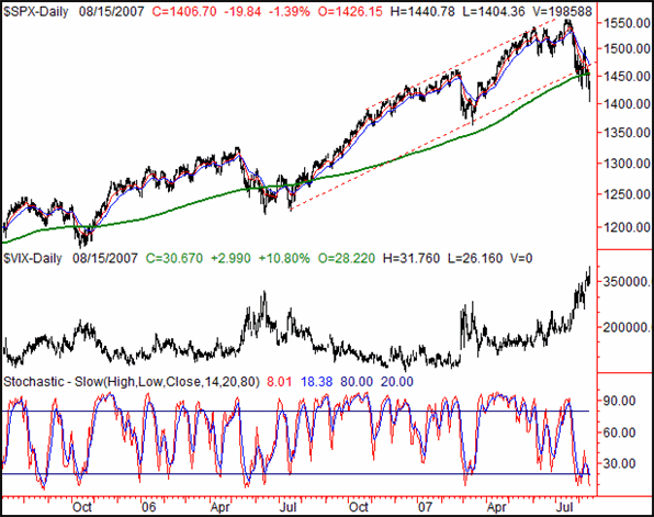
The S&P 500 fell by 19.84 points yesterday (-1.39%), ending the session at 1406.70. For the week, it's now in the hole by 3.23%, or 46.94 points.
We know we took up a lot of room with the NASDAQ discussion, but we did want to throw in a couple of comments about the SPX chart. Specifically, take a look at the move under the 200-day line, as well as the move under the intermediate-term support line (red, dashed). It is what it is.
On the flipside, we also have to add that the SPX's last two crosses under the 200-day line didn't go much further under it than the current one is. And with the VIX at multi-year highs, we can't be surprised if this market does a 180 soon....though we're certainly not taking that bet yet. As of right now, the bears seem to have control.
S&P 500 - Daily
The S&P 500's weekly chart (with the VIX) shows us a little more promising picture than the same of the NASDAQ....though it still leaves open the possibility of some short-term downside. The SPX's support line (red) is at 1323, or about 80 more points under where we are now. On the other hand, the VIX is just ripe to get rolled back.
S&P 500 - Weekly
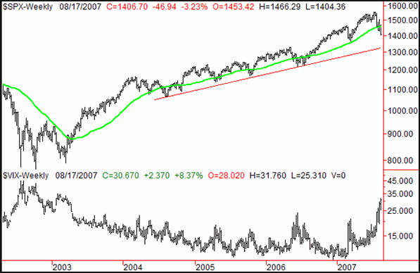
As for the next clue, both the 10 day average as well as the 200 day average are at 1453. A move above them would be bullish, while a failed effort to move above them would be bearish. But just to be safe, we're using the 20 day line as a bullish signal line at this point. It may take a coupe of days to really say which is which, but we'll let you know when we see something take shape.
Dow Jones Industrial Average
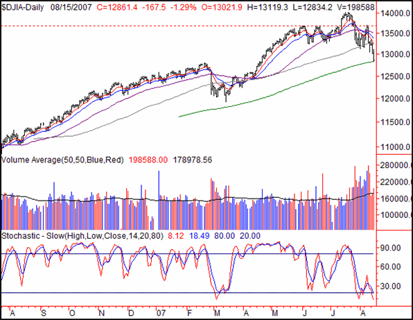
The Dow's close of 12861.4 on Wednesday was the result of a 1.29% (-167.5 point) loss. That translates into a dip of 2.86%/-378.1 points for the week so far. We can't look closer today but we'll enhance the Dow's commentary this weekend. Do note, however, that the Dow found support at its 200 day average on Wednesday.
Dow Jones Industrial Average - Daily
Price Headley is the founder and chief analyst of BigTrends.com.
|